I've been using Caret on and off as my Mac Markdown editor. I sometimes switched back to iA Writer for features Caret hadn't implemented yet, or to Ulysses for more control over the style.
But in the past few weeks I've taken to writing almost everything in Caret. It's gained enough features that I find it the best option for Markdown on a Mac right now. And I enjoy it so much that I miss it when I'm writing on a phone or tablet.
Here are my favourite things about Caret:
Auto-complete of local files
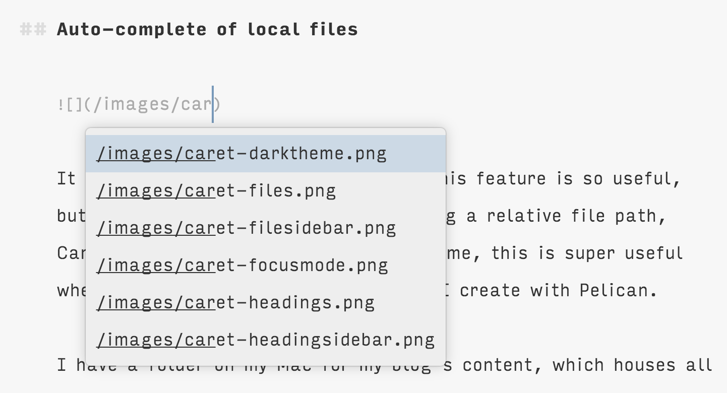
It took me a while to understand why this feature is so useful, but now I totally get it. If you're using a relative file path, Caret can autocomplete it for you. For me, this is super useful when writing posts for my blog, which I create with Pelican.
I have a folder on my Mac for my blog's content, which houses all my Markdown blog posts. It has a folder inside it called "images", and I insert images into blog posts as I'm writing with a relative file path. With Caret, I don't have to remember the exact name I gave the image, because it can suggest file names to me. This is especially helpful when I'm using a lot of images, in posts like this one about Things 3.
Image previews
Speaking of images, one of the other amazing things about Caret is that it will grab your image files and insert them right into your Markdown file. iA Writer does this in preview mode—if you use a relative file path it can find, or a URL to an image you've uploaded somewhere, iA can show you the image in your preview instead of the Markdown image formatting.
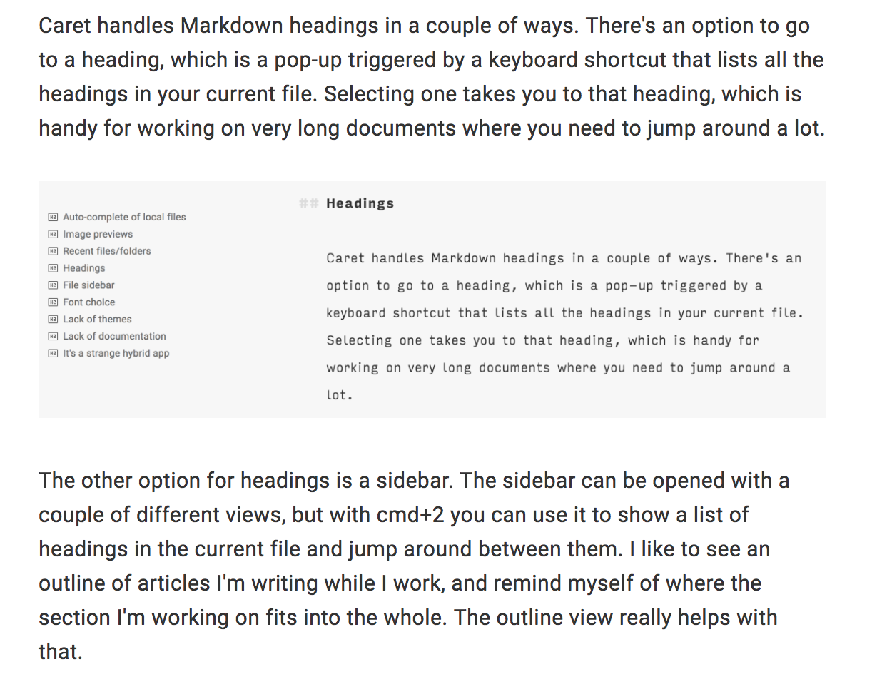
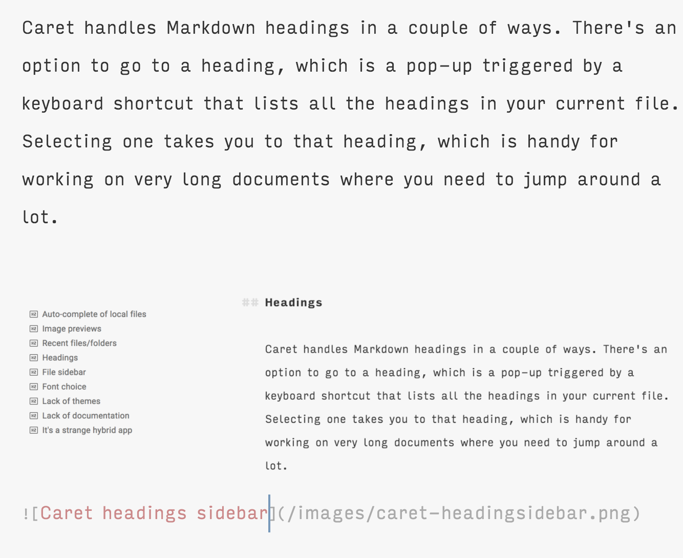
But Caret goes a step further and shows you the image right inside the editing view. When you're working on a post where you need to write about the images, or look at the images to check that you're writing the right thing (e.g. explaining how to use a feature or reviewing a product), this is super helpful. (Though I have to admit, it starts to get confusing when all the images are screenshots of Caret itself, as with this post. Right now I have an image in this post of an image in this same post!)
Recent files/folders
Caret has some really handy shortcuts built-in to help you find files. One is the "open recent" shortcut. There's one for recent files and a separate one for folders. In each case, you get a pop-up that lets you search for or browse recently opened files or folders and choose one to open.
I really like the recently opened folders option, because although I use Caret all day long, I tend to switch between different contexts like my day job, my personal blog, and working on Hello Code projects. All of these switches require me to go up and down several levels of folders to get to where I want to open or create a file. But with the recent folders option, I can quickly switch in and out of folders I use often, even though they're at different levels of hierarchy in my file system.
Heading interactions
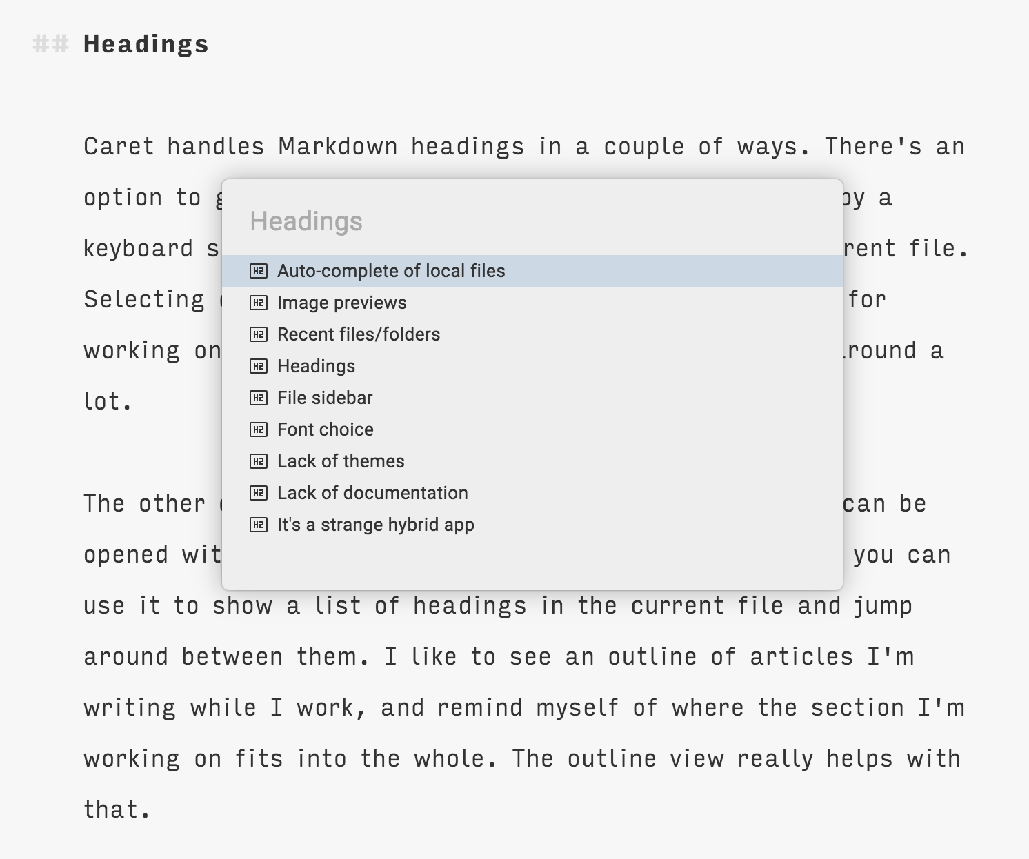
Caret lets you interact with Markdown headings in a couple of ways. There's an option to go to a heading within your file, which is a pop-up triggered by a keyboard shortcut that lists all the headings in your current file. Selecting one takes you to that heading, which is handy for working on very long documents where you need to jump around a lot.

The other option for headings is a sidebar. The sidebar can be used to show a few different things, but with cmd+2 you can use it to show a list of headings in the current file and jump around between them. I like to see an outline of articles I'm writing while I work, and remind myself of where the section I'm working on fits into the whole. The outline view really helps with that.
File sidebar
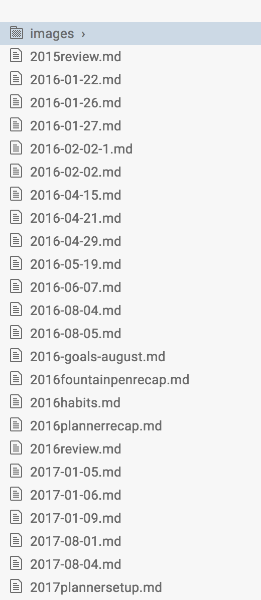
The same sidebar that's used for the headings/outline view can also be opened with cmd+1 to show all files in the current folder. I'll get into this more below, but Caret acts a bit like a text editor you might use for coding (at least, I've seen this implemented in Atom, so I'm guessing that's where it comes from). It lets you open an entire folder, rather than a single file, then lets you use the sidebar to jump between other files in the same folder.
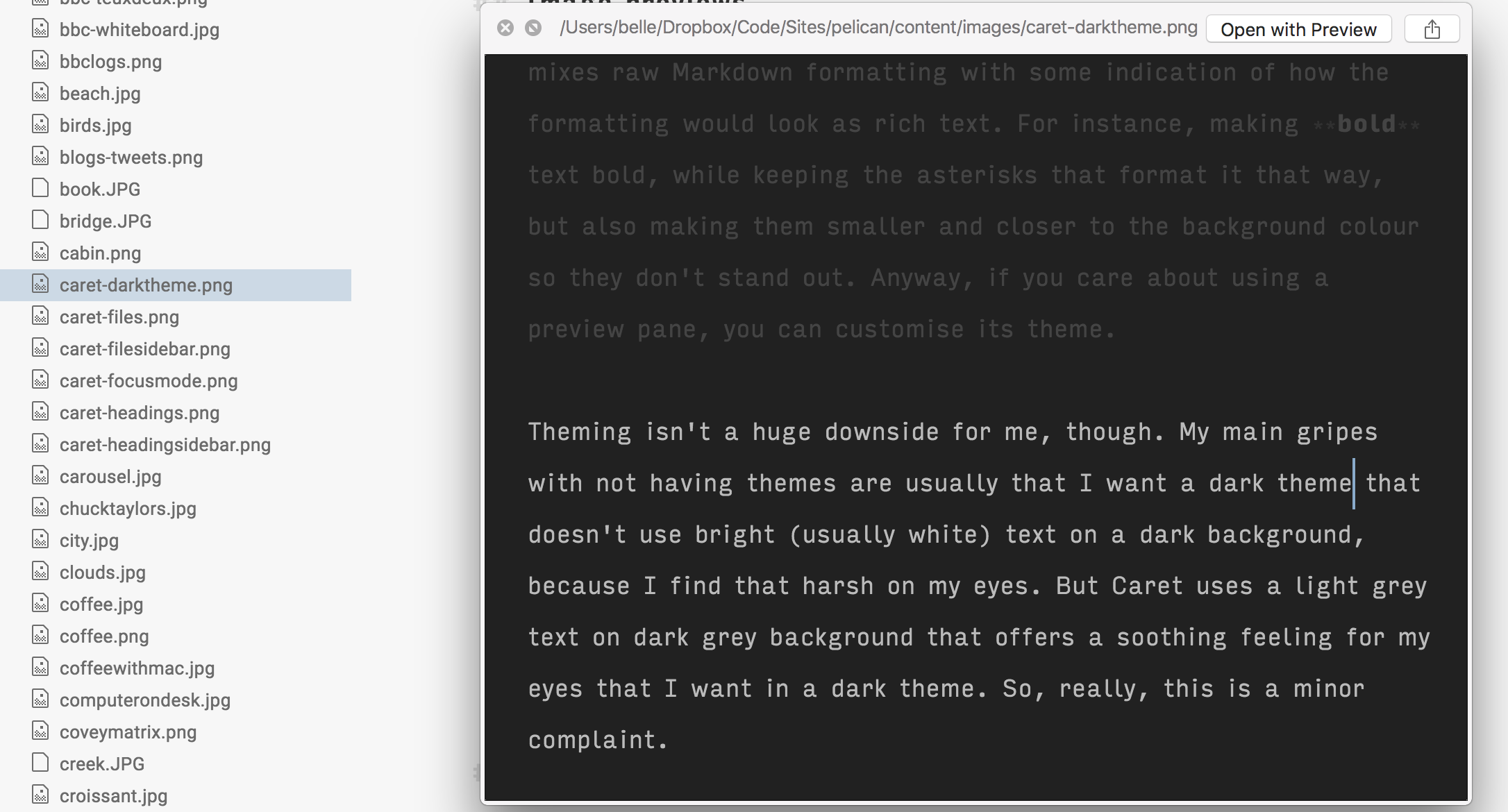
The sidebar doesn't only show Markdown files, though. If you have images in that folder, they'll be visible too. And with a tap of the spacebar on Mac, you can see a preview of the image. Again, this is really handy for working with local images on my blog, as I can look through a few images to find the one I want or compare different options before choosing one, without ever leaving the post I'm writing.
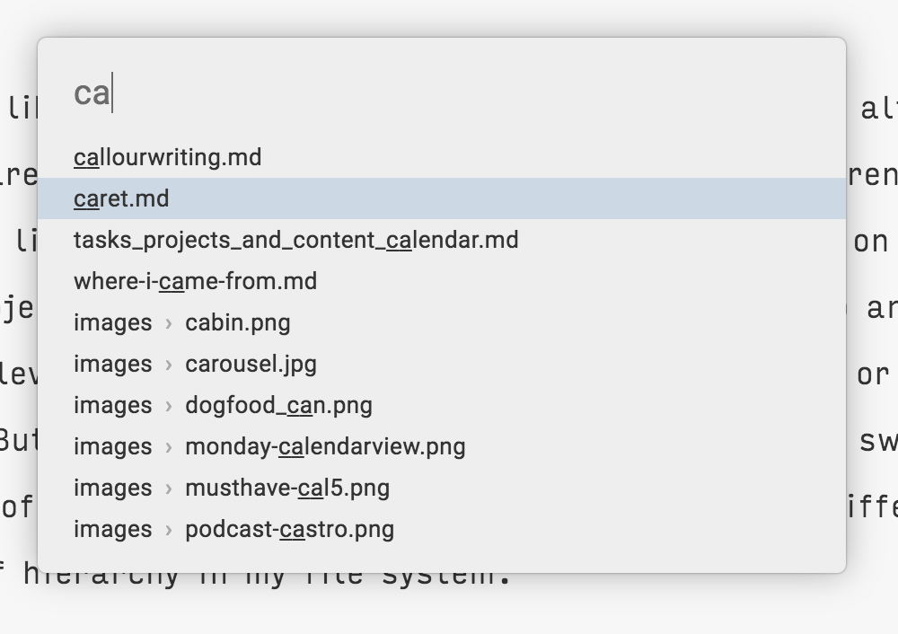
You can also search through files inside the current folder using a pop-up triggered with cmd+t. Although this offers almost the same functionality as the sidebar, I like having both options to access files in the folder I have open. I tend to use cmd+t when I know the file I want, because hitting the shortcut and typing a few letters is the quickest way to open a file I'm looking for. But when I want to browse my files because I'm not sure what I'm looking for, the sidebar is a nicer way to do so.
Font choice
Caret lets me choose whatever font and line-height I want. Some people won't care about that, but I do. I like iA Writer's choices so I've gotten used to not changing the font in that app, but whenever I get the choice I tend to use a custom font. These days I use a variant of Input Sans (narrow, light) for almost all my writing and programming.
Now for the downsides. These, like the upsides, will be different for everyone. These are just the things that bother me most.
Lack of themes
While Caret lets me choose my own font, it doesn't (yet) let me create my own custom theme. This may come in time, but for now I'm stuck with two default themes: one light, and one dark.
You can create custom themes for the preview, but I'm very anti-preview. I love how Caret (though it's not the only editor to do this) mixes raw Markdown formatting with some indication of how the formatting would look as rich text. For instance, making bold text bold, while keeping the asterisks that format it that way, but also making them smaller and closer to the background colour so they don't stand out. Anyway, if you care about using a preview pane, you can customise its theme.
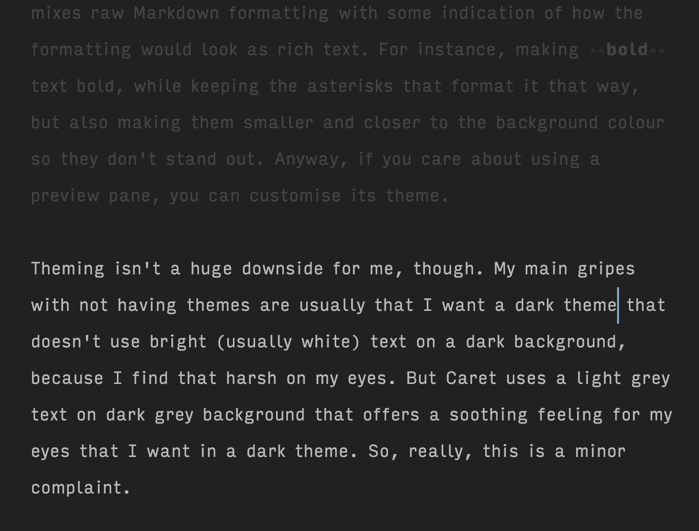
Theming isn't a huge downside for me, though. My main gripes with not having themes are usually that I want a dark theme that doesn't use bright (usually white) text on a dark background, because I find that harsh on my eyes. But Caret uses a light grey text on dark grey background that offers the soothing feeling for my eyes that I want in a dark theme. So, really, this is a minor complaint.
Lack of documentation
A much bigger issue for me is the lack of documentation around how to use Caret. The developers are extremely responsive and involved with their users on GitHub, where they take feature requests and bug reports. But constantly adding exciting new features is useless if nobody knows how to use them!
I've given up on Caret a couple of times in the past because I felt it was missing features or ways to implement my personal workflow, only to find out much later that I was wrong. Lack of documentation has left me flummoxed and frustrated. Which is especially bad in light of the fact that after finally figuring out how to use all the features in Caret that are useful to me, I love it! Imagine missing out on using an app that makes it easier and more enjoyable to do your work because you just didn't know how to use it!
It's a strange hybrid app
Remember that I'm just a user of this app, so I'm guessing about the design decisions behind its features. Having said that, it seems to me that Caret is a hybrid that falls somewhere between a Markdown editor and an IDE like Atom.
Having used lots (seriously, I mean lots) of Markdown editors and very few IDEs (I do pretty much all my coding in Xcode), I find some of the design decisions of Caret confusing. For me, text as code and text as writing are very different, and require different treatment.
For instance, opening a folder makes sense when you're coding. You're working with a bunch of files all at once within the project's folder, so you want easy access to them all. But when I'm writing an article I don't care about the folder it's in, or the other files in the same folder. The folder is usually one that holds all the blog posts I've ever written for a particular blog, or all the marketing copy for a product. Most of those files aren't relevant at all anymore, and certainly not while I'm creating something new.
The file browsing options in Caret are great. But opening a folder feels strange and awkward to me.
Another example is a keyboard shortcut change that drives me nuts. Here's a process I follow all the time when working with text: with my cursor at the end of the last line of a paragraph, I use cmd+shift+left arrow to select from my cursor to the beginning of the line I'm on, then alt+shift+up arrow to extend that selection to the beginning of the paragraph. This works in pretty much every Markdown editor I've used, and in Xcode, where I do all my programming.
But in Caret, after selecting the line I'm on, when I hit alt+shift+up arrow, the entire paragraph is not selected, but instead moves up a line, closer to the paragraph above it. Caret has a few shortcuts for doing things like this: move line up, move line down, duplicate line, split selection into lines. I think these shortcuts show how Caret's developers think of it as part-IDE. Writers don't think of their text in lines. We think in sentences, if not paragraphs and words (and word counts).
Developers think in lines. But I'm a developer, too. And I think in lines when writing code, not when writing prose. The difference is in how text is used. Not all text is the same, and it often requires a different treatment.
These strange decisions make Caret feel less like it's an app made for me, despite being a Markdown editor, which is one of the app categories that's certainly aimed squarely at me. I feel less at home because my selecting text shortcut doesn't work here, but does something unexpected. And having to open a folder in Caret before I can get to the file I want feels unusual and awkward.
As you can tell, this is my biggest gripe with Caret. Some of these changes came with version 3.0 and I wasn't the only existing user who found the changes abrupt and confusing. But I've since found a way to make Caret's features work for me, even if it's taking some time to learn a new workflow.
Here's what my process looks like these days:
- Open a new window with cmd+shift+n (another bug bear: I can do this with cmd+n in iA Writer and other apps, but in Caret cmd+n creates a new document inside the same window)
- Use cmd+shift+e to open the recent folders picker, or cmd+shift+o to open a folder via Finder
- Use cmd+t to open the file I want, or just start typing if I want to create a new one
Once I get the hang of this process, I'm sure it'll feel smooth and seamless. In the meantime, Caret has enough features I love (and can't find all together in another app) that I'm happy to stick with it.
To conclude, here are a few other things I like about Caret that I didn't want to discuss in detail:
- It's not Mac-only! Although I use a Mac, I also use an Android phone, so I'm no stranger to being unable to use software I love because I don't play exclusively in the Apple sandpit. Caret is available for Windows and Linux as well as Mac, and it warms the cockles of my heart that they're not making it exclusive to Apple customers.
- Typewriter mode! I hate typing without typewriter mode now that I'm used to it. For those who don't know, it keeps the line you're typing centred on-screen, so you don't have to look at the bottom of your screen or scroll up all the time.
- Focus mode! To go with typewriter mode, you can make all your text fade away except the current paragraph. I've added keyboard shortcuts to both typewriter mode and focus mode through the system settings, because I turn them on and off a lot when switching between writing and editing modes.
- Copy as HTML in a way I like! Lots of apps will let me copy my Markdown text as HTML, but they tend to do things I don't like. One particular issue I have is adding
<figure>tags and captions to my images when I don't want them. I use simple<img>tags inside<p>tags for most of the blogs I work with, because that's what they can handle, and there's no way to stop those being included in the copied HTML from most Markdown editors. But Caret doesn't use those, and I find that useful. It also does a good job of preserving my formatting when copying as Rich Text, which I do whenever someone forces me to work with Google Docs (shudder).
Caret has a free trial, so if you think it sounds cool, you should check it out. The developers are very nice and very responsive, so hit them up with any questions you have about it. If it's not for you, that's cool too. I've tried lots of Markdown editors that are not for me, and some that are almost, but Caret is definitely for me. (In case it's not obvious, they didn't pay me to write this, and that link is not an affiliate link of any kind. I just wanted to share my thoughts, good and bad.)